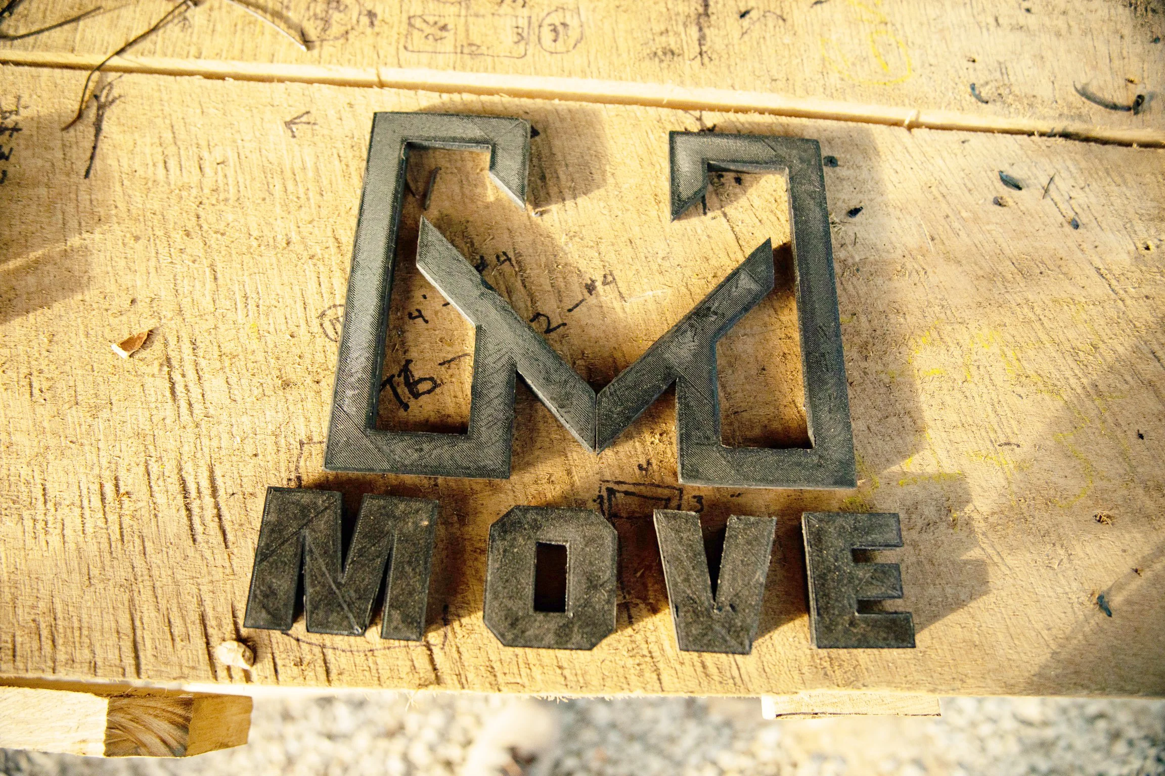
MOVE Ministries
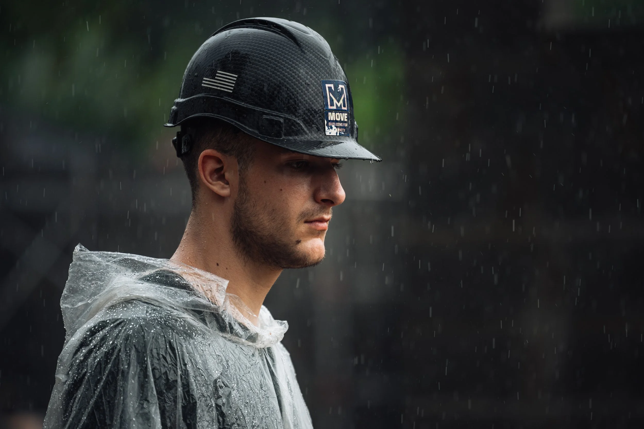
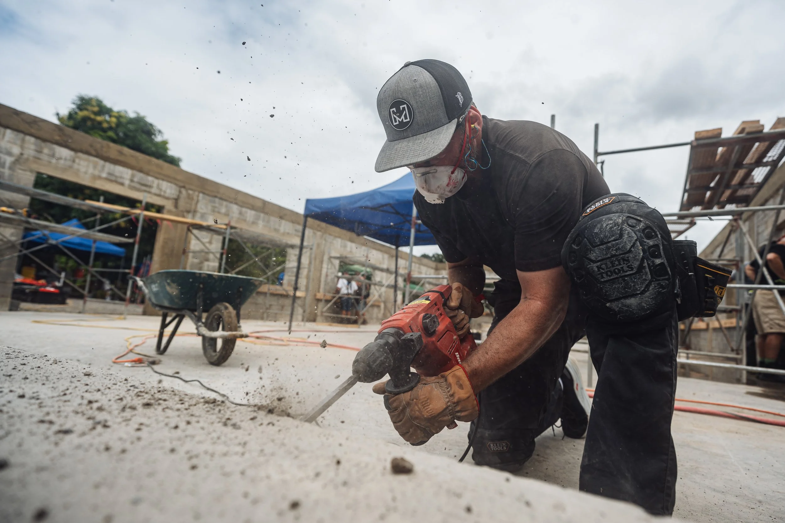
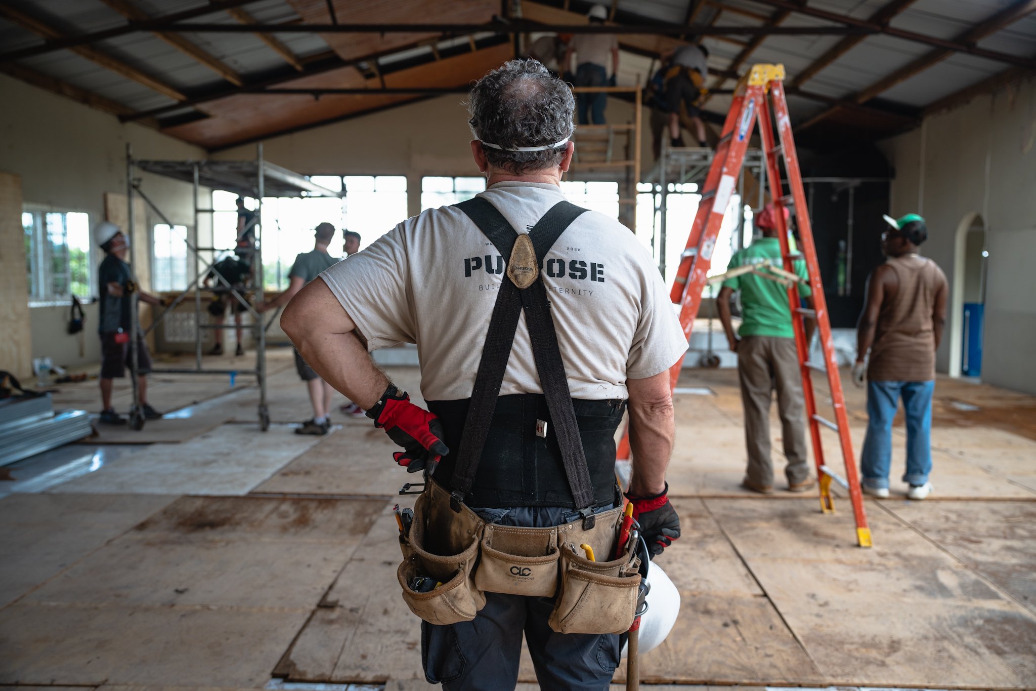
MOVE Ministries, a longstanding champion of building essential infrastructure in impoverished areas for four decades, embarked on a quest for a brand identity that would authentically mirror their mission. The creation of MOVE's logo mark presented a unique opportunity to infuse profound significance into the design. I centered my attention on the arc of the letter "M," which intentionally resembled an arrowhead, poised as a beacon for the present moment; a vivid testament to the transformative power of action. The scope of work was to develop a new brand identity that would authentically mirror their current mission and grow interest in younger generations of volunteers. Simplicity was a major guiding principle. The logo needed to be something that could be physically constructed, using materials such as wood, rebar, or concrete. This decision held special significance, as it served as a nod to the dedicated volunteers of MOVE, many of whom are working professionals or veterans with a profound connection to the brand.
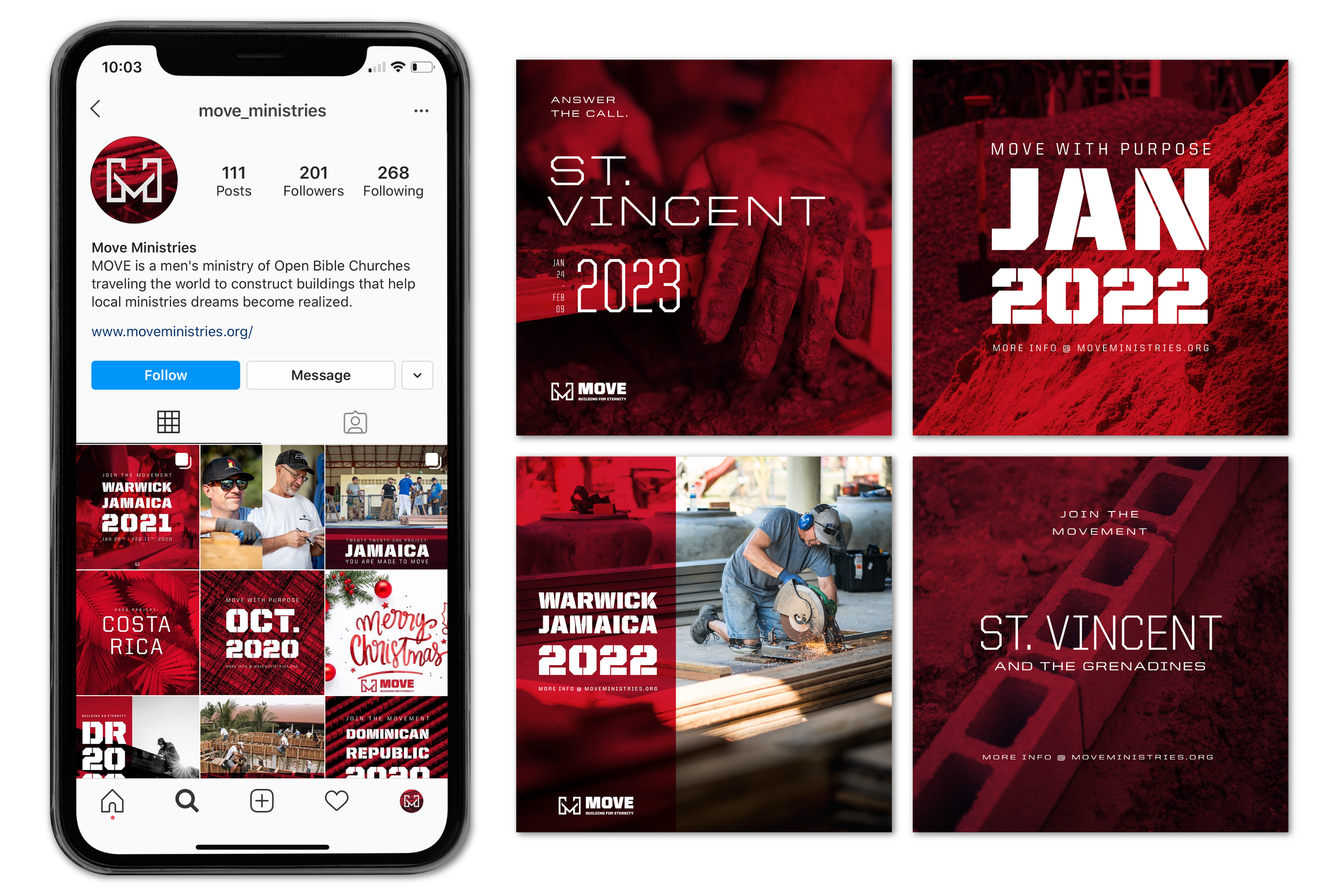
Every facet of MOVE's brand received enhancement. The redesigned brand now boasts a deliberate visual aesthetic, complemented by a refined color palette that echoes a boldness within the construction genre. I established a traditional hierarchy, fashioned a compelling social media persona, and devised apparel designs that seamlessly embodied MOVE's vision. This comprehensive transformation has birthed an effective, unforgettable, and motivational brand that fully aligns with the organization's mission and aspirations.
Logo mark animated to represent the “here and now” focus.
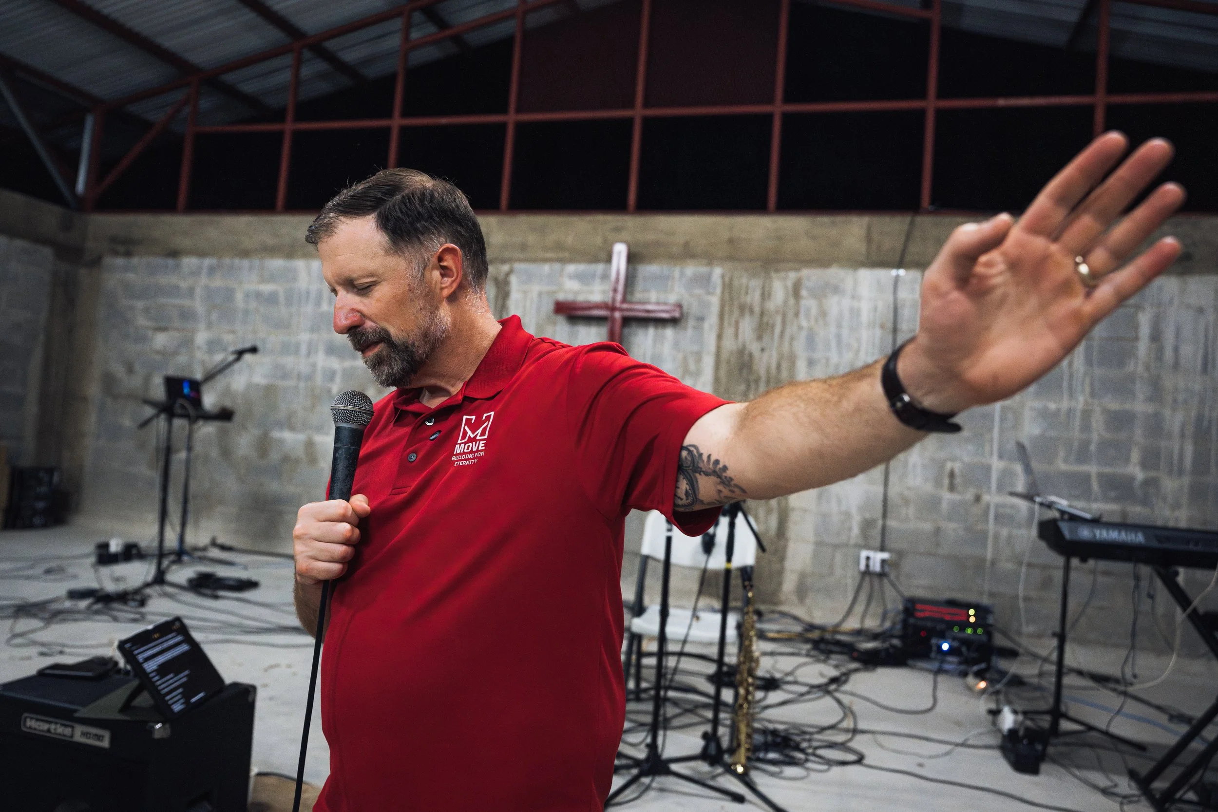
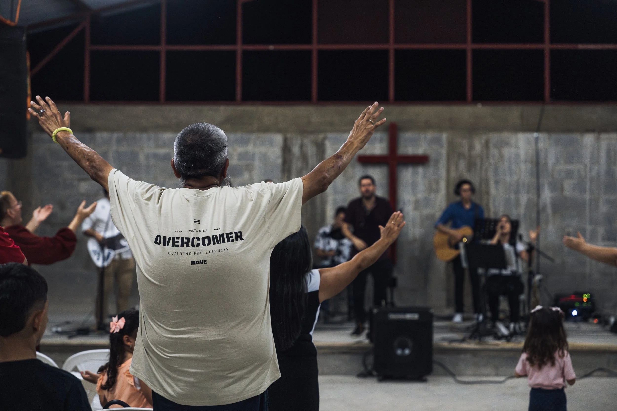
New apparel designs and logo applications for various trips both overseas and domestic.
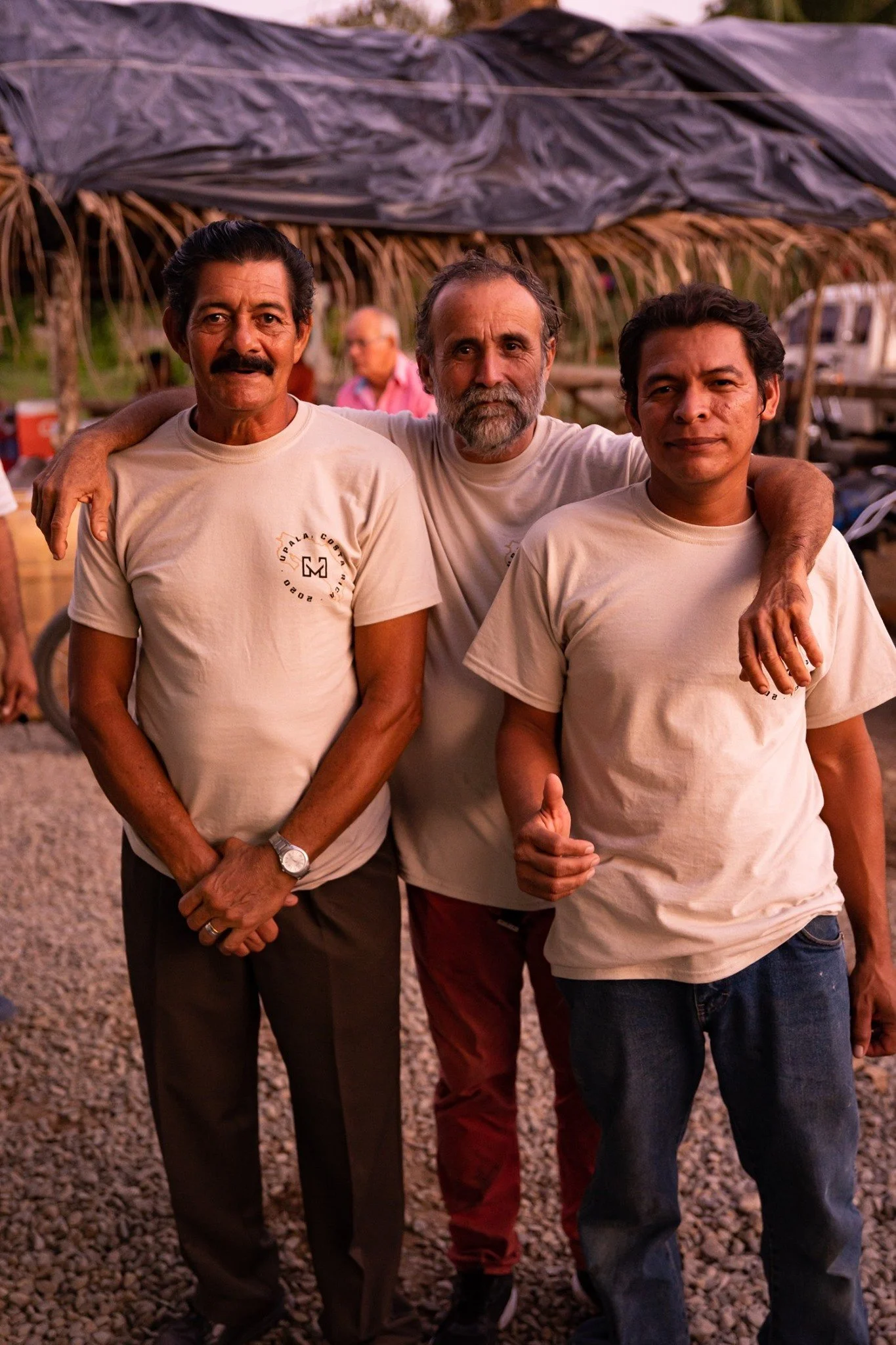
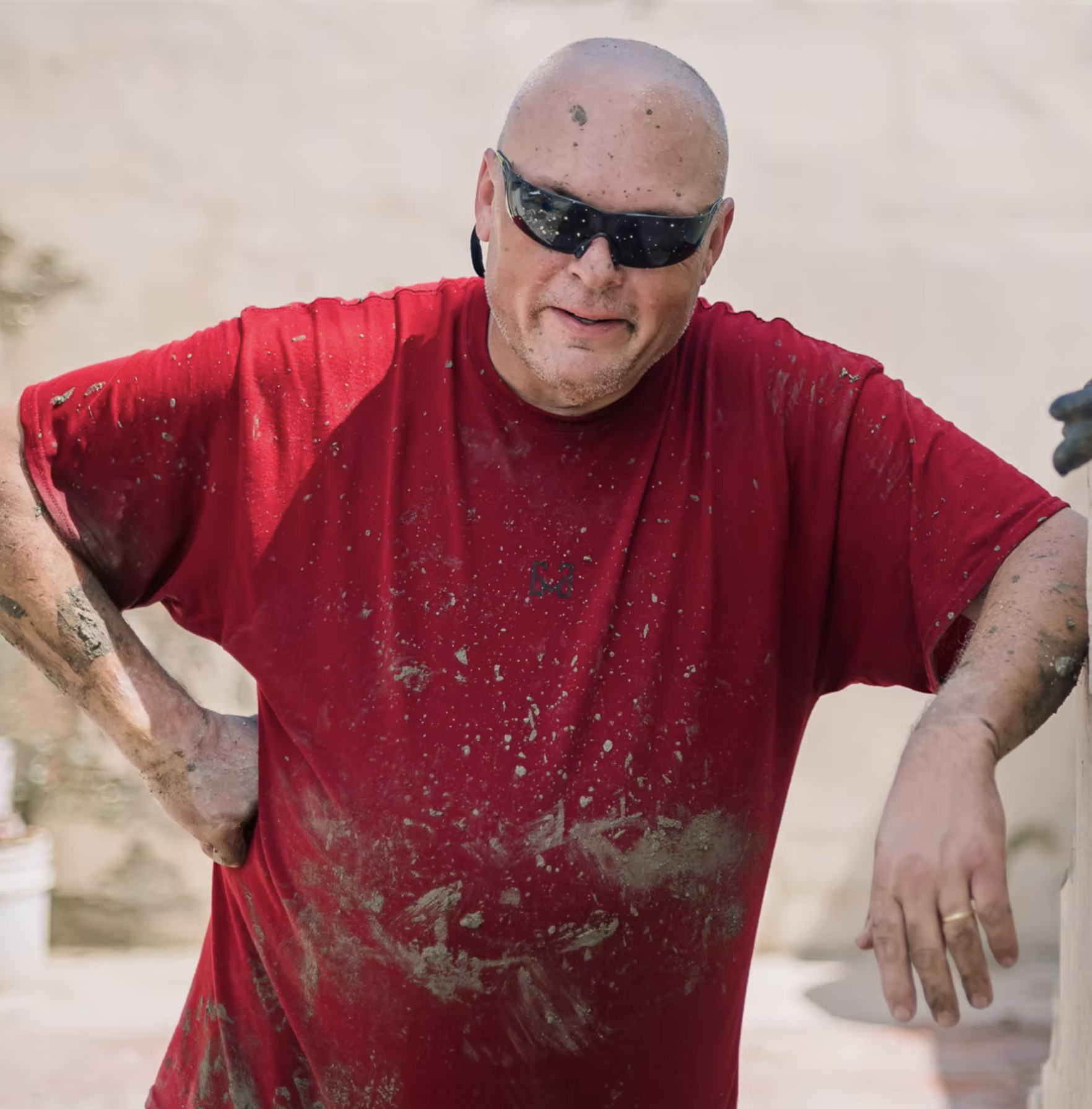
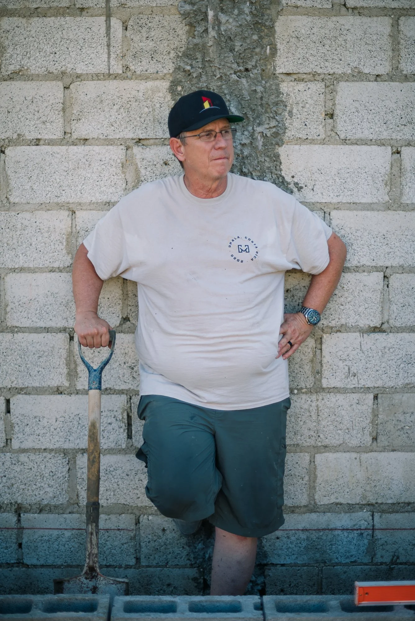
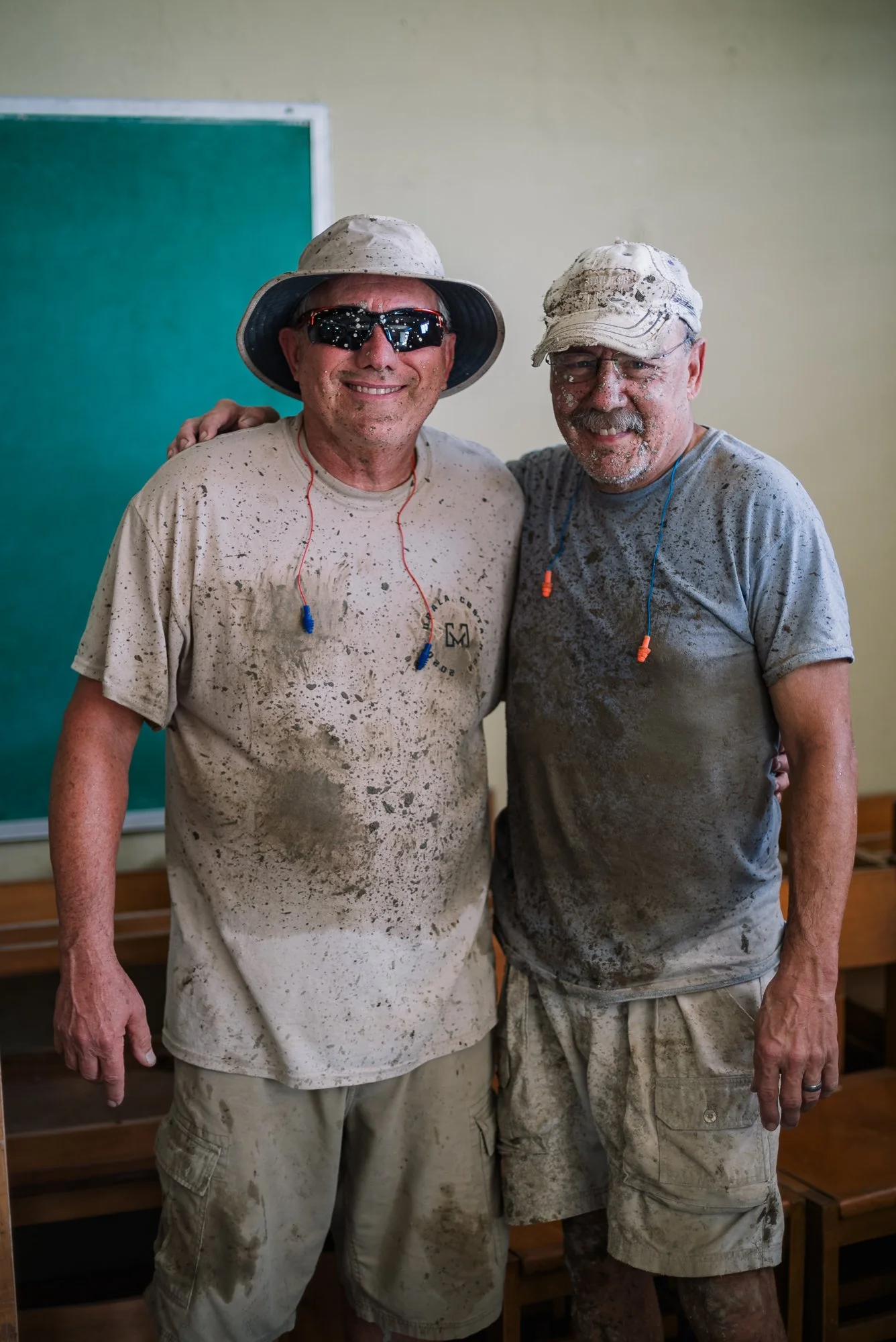
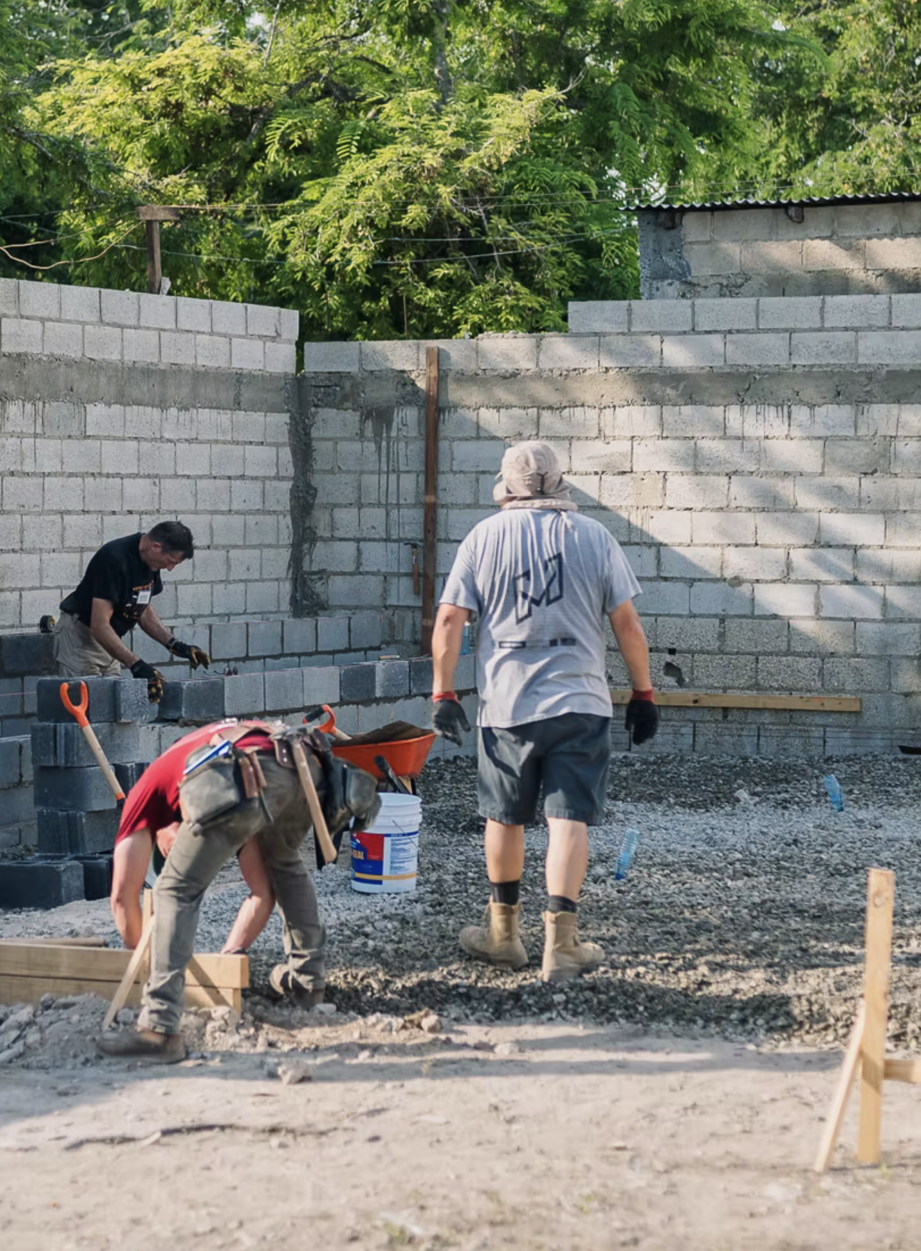
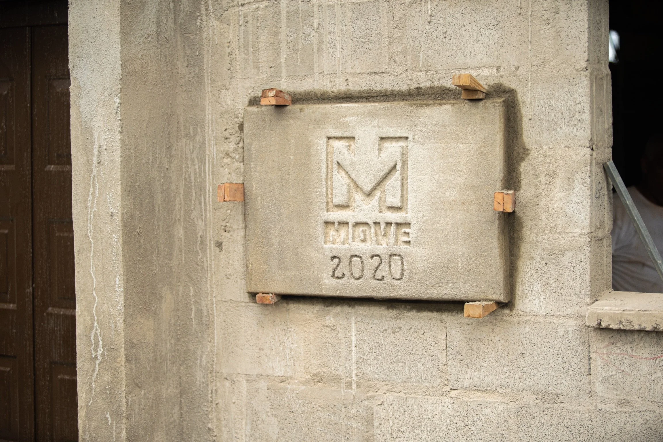
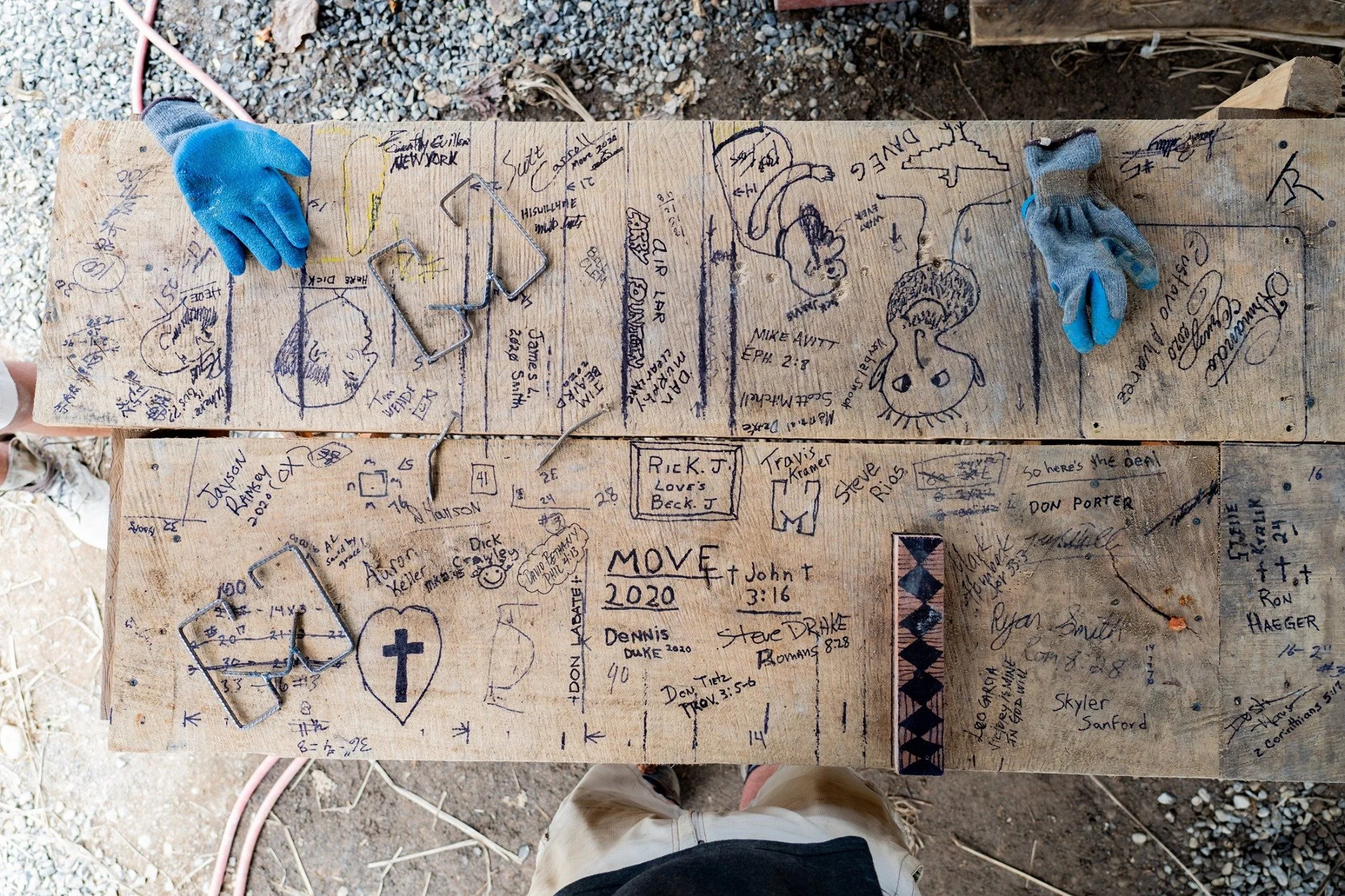
The mark interacts well with the men and their various personalities.
New social media presence.